Monday, 16 December 2013

My Target Audience

My Target Audience


The target audience for my music magazine will consist of both men and women as both genders enjoy listening to pop music. The age bracket for my target audience will mainly consist of 16-30 year old's, particularly people between the age of 16 and 25 as these are considered as youths and are more likely to be the biggest fans of this Pop music genre. 

UK Tribes:
Using the Channel 4's UK Tribe website, I have discovered that the particular youth society that would fit my target audience are 'Townies'. 

'Townies' are people that are seen to go with the flow. They love to keep up to date with all of the latest celebrity news and they mainly listen to the popular chart music. Townies also like fashion and tend to follow the crowd. Alcohol is connoted with Townies as they like to have that buzzing feeling and like to have fun. Therefore, Townies are my target audience. 

Social Networking:

The main social networking sites that my mass market target audience use consist of Twitter and Instagram as these are the most popular social networking sites. 


Twitter is an online social networking and blogging service which allows users to read and reply to other people's 'tweets' as well as 'tweeting' things themselves. Twitter is an extremely popular social networking site and there is over 230 million active twitter users and in total there are roughly 500 million tweets per day. 


Instagram is an online photo and video sharing social networking service that allows its users to take photographs and apply digital filters to them to improve the quality and share them on a variety of different social networking sites for many people to see and there are also options to 'like' and 'comment' on other people's photo posts. There is over 150 million users on instagram and over 1 billion likes each day. 


Brands Favoured by my Target Audience:


Concerts/Festivals my Target Audience Would Attend:


The following image shows the questionnaire that I have created to find out the different things that my target audience like. 


Using Survey Monkey, I have made my survey available to people online as well so that I can get a wider range of answers from all over the country. If you would like to visit and complete the online version of my questionnaire then please visit the link below. 


Sunday, 15 December 2013

Chosen Music Genre

My chosen genre - Pop Music

The term 'Pop' originally came from the word 'popular' which implies that it is one of the most well known genres in the music industry. This genre of music draws in thousands of listeners world wide and consists of mainly top of the charts music. Pop music is seen as a type of music that implements different types of genres, such as dance and rock, into one genre which is why it is such a popular genre as it has music that fits many preferences. 

Many different artists come under the pop music genre, a particular well known artist is Michael Jackson who was known as 'the King of Pop' as he was the artist who helped pop music to become a lot more well known. Many other successful artists consist of the following:

  • Rihanna
  • Lady Gaga
  • One Direction
  • Justin Bieber
  • Justin Timberlake
  • Beyonce
  • Taylor Swift
  • Miley Cyrus


The factor that many people love about pop music is that there is always a song that you can play to fit your mood. 
This shows that the music that these artists bring out is always changing, as well as their music changing, the way in which they present themselves is also always changing in order to keep up with the popular genre that their music fits in. 

Pop Music Videos

The music videos for pop songs usually always tell a story and if they are not telling a story then they often appear to be quite sexual. I find this unusual as pop music is usually aimed at the younger generation and having sexual music videos is rather inappropriate. This implies that the pop music target audience is changing from the younger generation to people around and within the age of 16-30 year olds. 

Pop videos also appear to be the most vibrant when it comes to colour, mise en scene and the music itself. The colours used in pop videos are usually bright and portray the party atmosphere using the bright flashing lights. The mise en scene adds to the party and club atmosphere through the choreographed dance sequences used in the majority of pop music videos. The mise en scene in pop music videos is also very evident through their costume choices as they usually wear extravagant outfits or they model what is in the trends and is commercially successful at the present time. 

Some examples of pop music:
Little Mix - Move


Beyonce - Love on Top


Wednesday, 11 December 2013

Finalisation of Music Magazine Title

Photo's for Pop Music Magazine

Front Cover:

This is the image that I am going to use for my front cover. The background is going to be edited completely white to give the image a front page look. I am also doing this as many music magazine front cover backgrounds are also plain white to allow the editors to take advantage of using many different colours to make the front cover look bright and colourful. 


Contents Page:


I have chosen this image to go on my contents page to advertise another artist that will be featured within my music magazine. I will cut the image of the artist away from its white background and place it on the bottom right hand corner of the contents page. It will be shown in a lower scale to the image of the music artist who is the main feature. I will also edit around the edges of this photo to improve the quality of it, I will particularly be focusing on editing her hair to make it look tidier around the edges. 


The black and white image on the left is the image i will be using to advertise the double page spread. The image shown on the right will be shown on my contents page to show what some people do on their typical weekends. This photo is very brightly coloured and will catch the attention of my target audience. 


Double Page Spread:


I have chosen four possible photographs for my double page spread. These images will require some editing to also improve the quality. 

One outfit is a simple white dress with a black hat, the other outfit is a black crop top with denim dungarees and a black snap back which gives the artist a young, casual and stylish look. 


The outfits are all very simple, however, they make good images for the double page spread.


These bottom two photo's are images of the artist in her underwear, however, she is positioned so that nothing inappropriate is on show, these images have been used as I have noticed that in many music magazines, artists are usually wearing minimal clothing. 


These images are also shown in black and white and this is a contrast to the above images that are shown in colour which will attract the attention of the readers. 

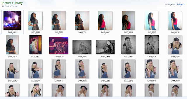
Photo's; Contact Sheet


Saturday, 7 December 2013

Photograph Research

I have researched several Pop music based magazines to gain an idea of how to present the front cover of my music magazine.My main focus is the different photo's that different magazines use on their front covers.


Contents:
I have researched further into the layout and structure of music magazine contents pages to see the different ideas that I could use for my own magazine. The music magazine contents pages that I have looked at are 'Q' and 'Mixmag'. 


This Contents Page is form Q Music Magazine. The layout of this contents page is very clear and well presented as the layout is very simple. The background colour of the contents page is plain white which gives the editors the opportunity of using a vast variety of colours on their page to make it stand out. Across the top of the page 'Q Contents' is written in a banner which runs across the top of the page. The 'Contents' part of this heading is written in a black banner in a white typeface. The 'Q' in this heading is in a red banner in a white typeface to make the title of the magazine look dominant. The contents page has a large long-shot image of the main feature in the magazine in the right corner, The Courteeners, this goes from the top of the page and ends three quarters of the page down emphasising that they are the main feature in the magazine. In a white box overlapping this photograph the name of the band is written to catch the readers attention, also in this white box is a quote which has been said by one of the members to give people a taster of what they will find written in their feature in the magazine. Another image that is shown on this contents page is a picture of another musician. This is another long-shot, however, it is on a much lower scale implying that this artists feature is smaller than The Courteeners. The subheadings of the magazine contents page consist of 'Features', 'Every Month' and 'Oasis Special'. The 'Features' and 'Every Month' subheadings are written in a white type face on a block red background. The words are written in capital letters to make them stand out so that people can find what they are looking for on the contents page easily. 


This contents page is from Mixmag Music Magazine. In comparison to the Q Magazine Contents Page, the background colour of the Mixmag contents page is plain black. This allows many vibrant colours to appear on the page and the editors of this magazine contents page have taken advantage of this. 'Mixmag' is written at the top of the page in lower case letters in a white typeface in the top left hand corner of the page. Several spaces along from this, in line with 'mixmag', 'December 2009' is written in capital letters in a small font in a yellow typeface which stands out on the black background. 'Contents' is then written next to this in a large font in capital letters in a white typeface which makes it clear to the reader that it is the contents page. The first image that draws in our attention is a large scale image of what appears to be an audience at a festival. Many different coloured pieces of confetti are falling down onto the crowd and where the colours used in this image are so loud it attracts the readers attention and makes them want to purchase the magazine. The contents page uses a yellow and white colour scheme throughout as all of the text is written in either a white or yellow typeface. The yellow typeface is mainly used for the page numbers, and the white typeface is used on the text that informs the reader of what they will find on each page of the magazine. Having a set colour scheme like this magazine allows the page to look very tidy and presents the information that is consists of very well to the reader. 

The Similarities and Comparisons between the two above contents pages;

Similarities:
  • Both magazines have a colour scheme running throughout their contents page. 
  • They both have straight lines separating each different section on the contents page. 
  • The page numbers are on the left hand side of the text. 
Comparisons: 

  • Q Magazine uses a plain white background, whereas, Mixmag uses a plain black background. 
  • Mixmag consists of 3 images on its contents page, one large scale image and two smaller scale image. In comparison to this, Q Magazine only consists of 2 images, one large scale image and one lower scale image.
  • Mixmag has used very bright and vibrant pictures, whereas, Q Magazine has used bright typefaces to make the page more appealing. 
  • Mixmag advertises albums on its contents page, whereas Q magazine does not. 
House Style; 
The house style of the Q music magazine contents page appears to be the red, white and black typeface colour scheme which runs over the entire page. For Mixmag, the contents page house style appears to be the white and yellow typeface, these are the only two font colours used on the entire contents page. 


Double Paged Spreads:


This double page spread from Q magazine shows that the main feature is Lady Gaga. They have used a single page for a large mid-shot image of her in black and white. Her hair looks very messy giving her a reckless look and the chains draped over her chest instead of clothing adds to this effect. Her gaze is directed at the reader, she is wearing very thick makeup around her eyes which makes them stand out. Her head is angled slightly to the right and her lips are parted slightly showing her two front teeth. On the second page is the article written about Lady Gaga and the large 'L' written in red over the article makes the page very appealing to the readers. This is a different style page to other magazines and is very original, the colour white, black and red all balance well together which makes the page flow. Having the giant 'L' written in a bold red typeface could signify importance about what is written on this page and as it is so big and bold it stands out and attracts readers. 


Possible Magazine Titles


I have decided to make a music magazine based on the Pop music genre. I have thought of several different names which I think would make good titles for this genre music magazine and a name that would attract the target audience and mass market.

I have thought about 'Infinity' as being one of my magazine titles, this is because infinity means no limit and I want my magazine to pass limits and continue. This title can be associated with Pop music as the mass market for this style music is rapidly increasing.  


I like the title Bassline as it is related to music and can fit any genre of music that you put it to. It is used in many styles of Pop style music and as a title it will attract a mass market which will make my magazine popular. 

I have considered 'More' as being the title for my magazine as I want people to know more about Pop music, this could also be adjusted to fit any genre of music. It is also a very short and easy to read title that can catch readers' attention. 


I have chosen EXC as a possible music magazine name. I will use it as the acronym for ‘Exclusive’ as I will be providing readers with all of the exclusive and new Pop style music. This is a very short title consisting of three letters meaning people will be able to remember and recognise the magazine name easily.


Elite is something considered to be superior. This would make a good title as it perfectly describes what my magazine will be like and it also links with the Pop style music genre that I have chosen as this genre music is becoming superior.