Below is an image of the page
measurements that I have used for my Front Page. The Width is 800 Pixels and
the Height is 1200 Pixels.
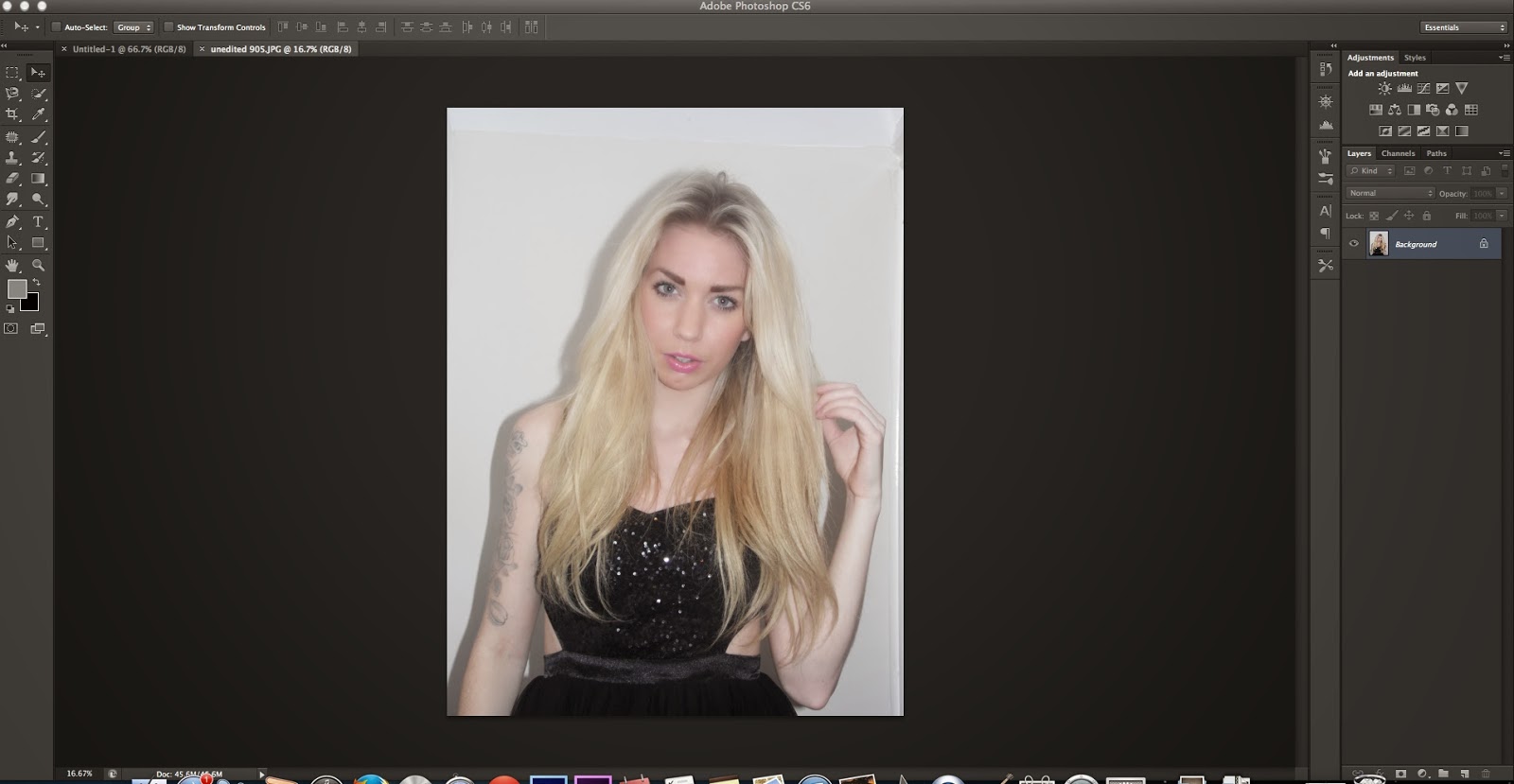
After confirming the page measurements, I dragged the image that I wanted to use as my front page into Photoshop and began editing.
Using the Liquify tool, I edited the image to make
certain features such as cheek bones and the jaw line to make them appear more
dominant. I noticed that these two facial features are usually edited and
focused upon on music magazines, especially when the model is a female. I used
the Pucker Tool to do this as this tool pinches the skin and brings it in to
give the model a trim and finished look.
After I had edited the image, I started to add some page furniture and design elements to bring my magazine to life. I started off by implementing a slogan into my magazine using the rectangle tool. I pulled this along the top of the page from left to right to create the box in which my slogan would be placed in.
To add straplines onto my contents page I had to use the text tool. I used this tool several times on my front page for the Masthead and for the different straplines that appear on the page to promote various music related things such as latest festivals etc.
This was my front page after all of the text that I had planned to place on the front page was added. The different straplines are dispersed appropriately around the main image and the main feature heading stands out on the page as it is in a bigger font than the other straplines on the page.
This was my front page after all of the text that I had planned to place on the front page was added. The different straplines are dispersed appropriately around the main image and the main feature heading stands out on the page as it is in a bigger font than the other straplines on the page.
Another tool that I used was the Elipse Tool. I used this to circle one of the straplines featured on my front page to make it stand out to the audience further. The elipse tool gave the strapline a more defined look therefore making it more noticeable.
This is what my front page looked like after I added the Elipse tool around the "Top 20 Hits" strapline. I also added a barcode at the bottom of the front page, I rotated the barcode onto its side as from my research I noticed that this is what many other music magazines such as NME do.
This is what my front page looked like after I added the Elipse tool around the "Top 20 Hits" strapline. I also added a barcode at the bottom of the front page, I rotated the barcode onto its side as from my research I noticed that this is what many other music magazines such as NME do.
 Extra changes that I made to my front page consisted of the brightness and contrast of the page. At the moment, my front page colours look rather dull and I decided it would be best to use the brightness and contrast tool on my entire front page to give it a bright glow to make it more appealing to my target audience.
 This is my front page after editing the brightness and contrast. The magazine now has pop music style look as all of the colours are bright and bold especially the typeface colours of bright blue and pink.


No comments:
Post a Comment